Dave Little Interview: The Man Behind Some Of The Most Seminal Artwork In Dance Music
This blog post for once isn’t about the DJ’s or producers of house/electronic dance music, we thought we’d write a post about the artwork, it was such a creative time for designs back then for clubs, flyers, record sleeves etc. Imagine Factory Records without Peter Saville, Joy Division without their covers, it wouldn't be the same – and the acid house scene and other genres that followed had so many iconic designs.
So as usual we go for who we think was one of the most influential, so this blog is about someone who was undoubtedly one of the top artists in the dance scene, the incredibly talented Dave Little.
So, Dave Little, where do we start. He truly is an immense talent, a purveyor of incredible arresting and innovative art. He’s a designer and artist who has worked for 3 decades in an array of media, from music to fashion as well as advertising and fine art. He’s now even doing work for Hollywood for companies like Disney, not bad!

In this blog though we’re going to concentrate in his work in the music scene, especially within the acid house generation. Some of you may not have heard his name, but I promise you will have seen some of his seminal designs, from classic flyers and album covers to club logos.
A protagonist and true visionary of the acid house era, creating some of the most seminal artwork in the scene, you will all have seen some of his designs. There’s been many amazing artists, but not many like Dave who was prolific and no one hit wonder.
So a quick rundown of people he designed artwork for in the music scene. Bomb The Bass, Stereo MC's, S-Express, Betty Boo, William Orbit. In terms of his classic flyers, sleeves and posters for clubs - he’s designed artwork most of you will know for people like Paul Oakenfold, Boy’s Own, Andrew Weatherall plus many more.
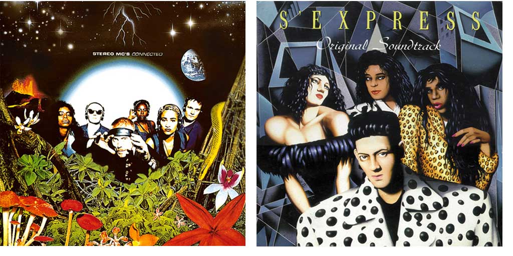
Here’s some of our personal favourite designs that Dave created, but there is so many more it’s hard to choose:
1: JIBARO ELECTRA - BALEARIC BEATS/SPECTRUM.
Released by FFRR in Sept'88. Compiled by Paul Oakenfold, Pete Tong and Trevor Fung. Design taken from the 'Spectrum' flyer.

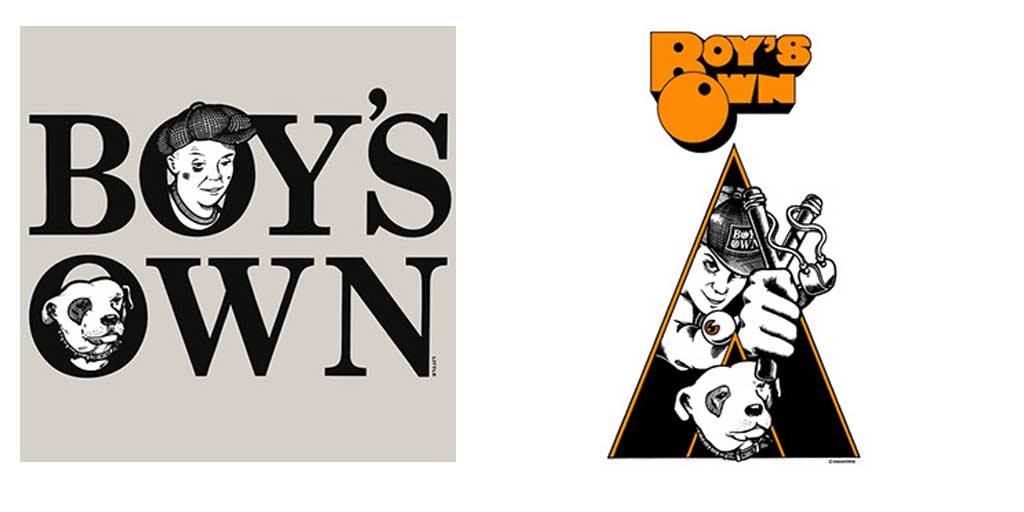
2: BOY'S OWN/JUNIOR BOY'S OWN.
Two designs for the famous fanzine and record label.
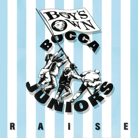
3: BOCA JUNIOR'S - RAISE.
Released in 1990 through BOP/FFEE.
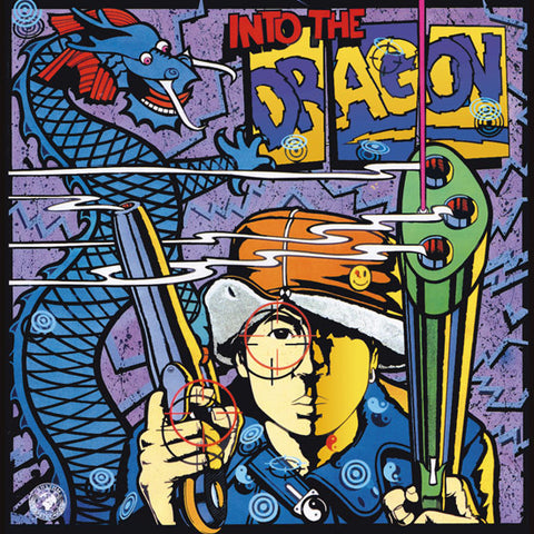
4: BOMB THE BASS - ENTER THE DRAGON.
Released by Rhythm King in 1988.
Q: So Dave, for the classic designs you created for the acid house generation - were you also into the scene and the music yourself, if so did this help to inspire your designs? Were they partly a visual representation of the scene you were experiencing, a way of expressing in art what the emotions you felt?
A: Well, yes, I was into the music, as in, hitting a nightclub kind of way. I never played the genre at home (Plus the was no CD compilations at the time). Except "Balearic Beats by Paul Oakenfold, which I designed the sleeve for). Sorry to say but Rock & New Wave Electronica were my forte (I think i saw AC/DC in 1987...nuff said eh?).
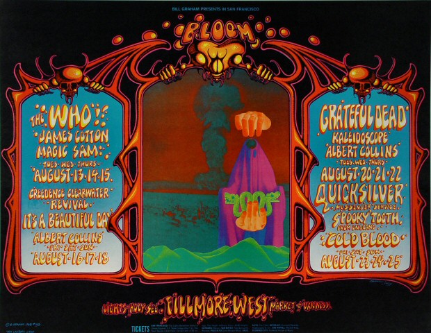
As for the "Spectrum" design, the border of the flyer was inspired by Rick Griffin, the Grateful Dead’s psychedelic artist. He did some of Ken Kesey's ‘happenings’ flyers in 1963-64. These were the worlds first acid parties. Way, way before Pink Floyd and the Beatles.
When "FUTURE" first opened (1987-The year before spectrum) I saw the psychedelic "2nd Coming" of those original innocent happenings/raves in San Francisco. I felt I had to show the concrete link of over 30 years lineage, of the acid way of thinking.
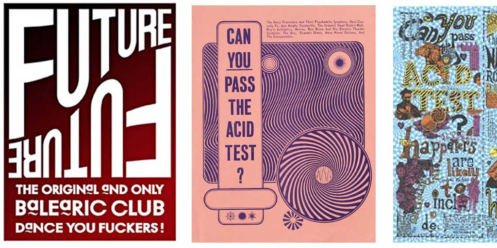
Also I personally wrote the phrase ‘Have you passed the acid test?’ on the back of Spectrum’s flyer. This was Ken Kesey's phrase on all his early flyers! Starting at Kesey's house in the woods of La Honda, California, the early predecessors of acid tests were performed.
These tests or mass usage of trips were performed with strobe lights and noise, which was meant to enhance the psychedelic experience. I had massively read of this 'Counter Culture' at art college ....Very few people spotted this.”
Q: Who were your biggest inspirations at that time, when you started? Who were the designers and movements, and maybe you have a couple of examples, that blew your mind? Maybe I’m wrong but I see some elements of constructivism in your work, bold striking elements and images that stay in your mind, as well as making you think. Not just pretty for the sake of it.
A: Well it goes back a long way. My Dad was a Chief Engineer on Oil Supertankers, so he took me, my Mum and brother round the world for 2 yrs on his ship the 'Al Sabia'. It was so huge you had bicycles at one end to peddle to the other! I crossed every major sea on Earth bar the arctic. I remember loads visually, especially India and Singapore.
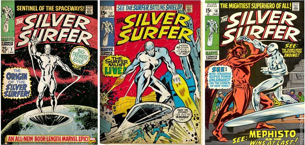
During those travels many of the British crew were young, so had loads of old-school vinyl, and I would look in wonder at these illustrated Covers, Blues, you name it! Plus a few crew would buy illustrated Marvel comics. My favourite was "Silver Surfer", plus a few had copies of American comics such as “The Fabulous Furry Freak Brothers” or comics by Robert Crumb, like fritz the cat and Mr Natural.
Hence this influenced me greatly, especially the American illustrated rock covers, but mostly American and British illustration Artists. Such as Robert Williams who painted 'Appetite for Destruction', this was the paintings name way before Guns & Roses used its name & painting for their LP release.
Also Ralph Steadman (Fear & Loathing artist) & Gerald Scarfe (Pink Floyd-The Wall). Big Daddy Roth. I have originals from Scrarfe & Steadman & Ralph liked my art so he gave me a really expensive print for my birthday!
Q: We also try and make bold high impact designs that make people think. Was this also your intention with the designs back then? How much of the artist’s album (if a record sleeve) or club (flyer, poster etc) would inspire the design, did you listen to the albums first for example before creating your famous record sleeves?
A: I'll give you one example. The cover for "Into the Dragon" by Bomb the Base, was briefed to me by Tim Simenon. He had travelled to japan and mentioned a 'new' comic style called "MANGA" which, If you weren't into comics you'd never have seen or heard of this (it was pre-internet remember). So that was his brief for a heavily graphic cover....He was right. It worked a treat!!
Q: What is your creative process, especially in club culture designs or your own fine art, where does an idea usually start? Do you believe your best work is when you’ve had no brief or virtually no brief, and a free reign to make the design?
A: Well Paul Oakenfold & Gary Haisman turned up at my flat (after I had designed the "FUTURE" flyer) and it was Gary who said "I want a great big fu*k-off trippy eye staring out at you. And the clubs name is "Spectrum" above it & "HEAVEN on EARTH" written below (as it was held at Richard Bransons club Heaven), well that was my brief.
So, as I mentioned before I knew instantly the graphic direction to take. I had bought a book from the USA "The Art of Rock" (Posters from Presley to Punk) and it showed loads of San Fransico psychedelic posters, especially "Rick Grif fins" Grateful Dead posters. This I knew would show that lineage I wanted to show, well the rest is history.
Q: Can a design just be good because it’s aesthetically pleasing, or does it always need a meaning?
A: It has to be at least aesthetically pleasing i reckon, but if you find a hidden meaning then thats an extra bonus right? I really think the very basics are 'care, time & attention" when creating work...I NEVER bang out quick rubbish....don't insult the public or the client I say!
Q: There was so much creativity in flyers, club logo’s, posters etc back then - where now it seems less risks are taken and more corporate. Do you despair, or is there modern designers you admire? Most artwork these days seems made by talented graphic designers, but IMHO graphic designers are not artists but can make things look nice. Just rarely anything that will be remembered or true creativity.
A: Now sadly, There is so much out there now its almost saturated (to a point). What with web, digital media content ect, pre internet you'd actually turn a street corner and see a poster you hadn't seen before. Now, its splashed up instantly on well, instagram? Back in the day you had to search and dig deep to find hidden visual jewels.
Q: Slightly morbid, but forget that part! You have 10 mins to live, what is the last 2 songs you ever want to hear? Doesn’t have to be house or even electronic - absolutely anything. A tough question I know, but two songs so special to you - which two would you choose?
A: "Its a Long Way to the Top (if you wanna Rock n Roll)" by AC/DC which signs about how long and hard that band tried before finding fame, and that means for me in life too!
And "Straight to Hell" by The Clash (Combat rock). It was released in 1982 the summer I arrived in London. I was playing the track as I arrived at Kings Cross station, also bizarrely, "Penny Smith" their official photographer studio was at the top of my road near my student digs. My old girlfriend was her assistant...check out The Clash - Before And After, by Penny Smith.
Check out Dave Little limited edition prints available to buy here, http://www.davelittle.co.uk/limited-prints.html and you can also see his club art history here http://www.davelittle.co.uk/club-art.html and classic record sleeve designs here http://www.davelittle.co.uk/sleeve-design.html
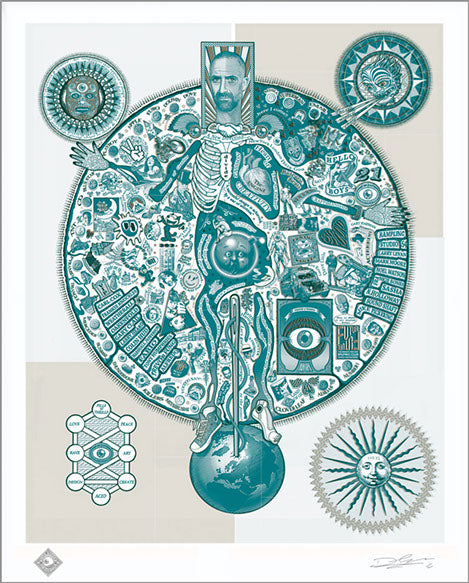
Here's an incredible piece of work that incorporates his designs for the acid house era, called "Map Of Acid". I saw it framed on the wall of Trevor Fung's house and I knew I had to have it. In fact, I've bought two - one for home and one for our factory!
So Future Past followers, what is your favourite artwork that Dave has designed? Please comment below, and why it resonated with you. For example, for me the balearic eye represents like looking into this incredible whole new world that acid house was (and still is), nights I've had that were so special it's hard to put into words, it was like entering a whole new world for a night (or a few..). And the Boy's Own designs, just so iconic and striking – just makes you want to learn more about Boy's Own as the designs are aesthetically pleasing but intriguing.


